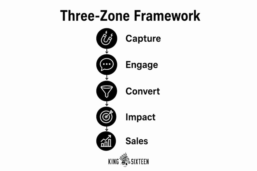
Product displays at events are defined as physical and visual structures that capture attendee attention, communicate brand value, and drive purchase intent within a live environment. The role of product displays at events goes far beyond decoration. They function as the primary tool that separates brands that get noticed from brands that get remembered. Industry standards define a three-zone impact for effective displays: capturing attention from 30 feet away, creating engagement at 3 feet, and securing final interaction at 3 inches. This framework, sometimes called the "three-zone impact," is the foundation of every high-performing product showcase at trade shows and brand activations. Kingsixteen applies this thinking to every physical environment it builds, treating the display not as a backdrop but as the brand's most persuasive salesperson in the room.
How do product displays influence attendee engagement and sales?
Product displays act as physical interrupts in high-traffic event environments. Attendees move fast, scan constantly, and make split-second decisions about where to stop. A well-designed display forces a pause. It creates a moment of curiosity that a sales rep alone cannot manufacture.
"Visitors bypass cluttered or unclear displays to avoid cognitive overload. Clean, high-value presentations increase perceived authenticity and invite longer interactions."
2026 research on display strategy confirms that product displays function as key brand storytelling tools that define perceived authenticity and value. That finding matters because authenticity is what converts a curious visitor into a warm lead. When a display looks polished and purposeful, attendees assume the product behind it is equally credible.
The impact of displays on sales is direct and measurable in behavioral terms. Longer visitor interactions in clean, well-defined booth areas correlate with warmer leads and more productive sales conversations. Clear product messaging does the qualifying work before a sales rep ever opens their mouth.
The displays that fail share one trait: they make attendees guess. When a visitor cannot immediately understand what a product does or why it matters, they move on. The goal of every display is to remove that guessing game entirely.
- Clarity over complexity. One product or product family per display zone prevents confusion.
- Height and sightlines. Products positioned at eye level or slightly above draw more natural attention.
- Open space as a signal. Negative space around a product communicates premium value, not emptiness.
- Staff positioning. Place team members at the sides of a display, not in front of it. The product should be the first thing a visitor sees.
What are the best design principles for effective product displays?
The most effective product display strategy uses a three-zone approach: capture, engage, and convert. Each zone has a distinct job, and designing them as separate experiences within a single booth is what separates professional displays from amateur setups.
The three-zone framework in practice
Zone 1: Capture (30 feet out). This is your brand's first impression. Bold graphics, high-contrast visuals, and a single clear message do the work here. High-contrast visuals and simple shapes increase impulse stop rates. Avoid text-heavy banners at this distance. Attendees read nothing from 30 feet away. They react to color, shape, and light.
Zone 2: Engage (3 feet). Once a visitor steps closer, the display needs to reward their curiosity. This is where product details, benefit statements, and tactile elements come into play. A museum-like, minimalist layout reduces cognitive load and keeps attention on the product itself.
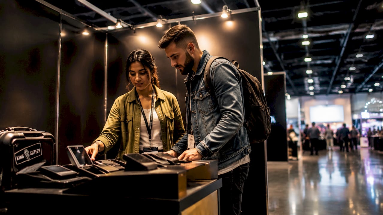
Zone 3: Convert (3 inches). At this distance, the visitor is already interested. The display should make the next step obvious: pick up the product, scan a QR code, or speak with a team member. Internally lit pedestals work exceptionally well here. Internally lit pedestals create a professional, premium aesthetic that elevates perceived product value at the moment of closest inspection.
Display design principles that hold across every event format
- Lead with one hero product. Place your strongest product at the booth's edge or most visible corner. Visitors pause naturally at edges, and that pause is your window.
- Use lighting intentionally. Focused lighting guides attention and elevates perceived product quality. Flat, overhead fluorescent light flattens products and kills visual interest.
- Eliminate clutter before the event. Every item on a display surface should earn its place. If it does not support the product story, remove it.
- Match signage scale to viewing distance. Large type for far-away capture, medium type for mid-range engagement, fine detail only at close range.
- Design for flow, not just aesthetics. Visitors should move through your display in a logical sequence without being directed by staff.
| Design Element | Purpose | Common Mistake |
|---|---|---|
| Hero product placement | Creates a focal point and stops traffic | Burying the hero among secondary products |
| Lighting | Elevates perceived quality and guides attention | Using only ambient overhead lighting |
| Negative space | Signals premium value and reduces cognitive load | Filling every surface to show range |
| Signage hierarchy | Communicates at every viewing distance | Using the same font size throughout |
| Staff positioning | Keeps the product visible as the first impression | Standing in front of the display |
Pro Tip: Treat your booth like a museum gallery, not a storage room. The fewer products you show, the more each one gets noticed. Curate ruthlessly.
How can storytelling and interactivity enhance product displays?
Storytelling is the difference between a display that informs and one that resonates. When products are arranged to tell a logical or emotional story, visitors spend more time and leave with a clearer memory of the brand. Combining lighting, thematic displays, and technology creates memorable brand experiences that outlast the event itself.
The most effective storytelling displays follow a simple arc: problem, product, proof. Show the problem the product solves, present the product as the answer, and provide proof through materials, testimonials, or live demonstrations. This structure works because it mirrors how buyers actually think.
Interactive elements extend dwell time and deepen engagement. Touchscreens, QR codes, and augmented reality give attendees a reason to stay longer and explore further. The key is to use these tools in service of the product, not as the attraction themselves. Technology that pulls focus away from the product undermines the entire display strategy.
- Touchscreens work best for products with complex features or multiple configurations that cannot all be displayed physically.
- QR codes should link to video demonstrations or detailed spec sheets, not just a homepage.
- Augmented reality is most effective for large products that cannot be brought to the event floor, such as vehicles, furniture, or architectural elements.
- Hands-on sampling remains the most powerful engagement tool available. Physical interaction with a product builds confidence and accelerates purchase decisions faster than any digital alternative.
Pro Tip: If you add a screen to your display, ask yourself: does this make the product easier to understand, or does it just make the booth look busy? If it's the latter, cut it.
Sensory engagement goes beyond sight. Sound, scent, and texture all contribute to how visitors remember a brand. A fragrance brand that lets visitors smell the product, a food brand that offers tastings, or a materials company that provides tactile samples all create multi-sensory memories that a static display cannot replicate. The goal is to give attendees something to remember that no competitor booth offered them.
What steps should marketers take to integrate displays into event marketing strategies?
Effective event marketing strategies treat the product display as a planned asset, not an afterthought. The display should be designed at the same time as the event strategy, not after the venue is booked and the budget is spent.
- Start with your goal, not your product. Define what you want attendees to do after seeing the display. Buy, inquire, share, or remember? That goal determines every design decision that follows.
- Map the visitor journey before you design. Sketch how attendees will approach, enter, and exit your space. Design the display to guide that movement naturally.
- Consult display and signage specialists early. Early planning that integrates layout, brand consistency, and lighting produces a more cohesive result than last-minute assembly.
- Align staff training with display design. Your team should know exactly which products are featured, in what order, and what questions each zone is designed to answer.
- Build in digital integration from the start. QR codes, lead capture tools, and social sharing prompts should be part of the original design, not added on the day of the event.
Beyond the physical setup, the importance of product displays extends into your broader marketing calendar. Displays generate content. A well-lit, beautifully staged product at an event produces photography and video that feeds social media, email campaigns, and sales decks for months afterward.
- Photograph your display before the event opens. The cleanest, most controlled shots happen before crowds arrive.
- Coordinate with partners. If a partner brand is present at the same event, align display aesthetics so joint photography looks intentional.
- Track engagement by zone. Use staff observations or simple foot traffic tools to identify which display zones attract the most attention and refine future setups accordingly.
- Debrief immediately after the event. Memory fades fast. Capture what worked and what did not within 48 hours of the event closing.
A unique selling proposition should be visible in your display from 30 feet away. If a visitor cannot identify what makes your product different before they reach your booth, the display has not done its job.
Key Takeaways
Product displays at events are the most direct tool a brand has to capture attention, build credibility, and drive sales conversations in a live environment.
| Point | Details |
|---|---|
| Three-zone impact | Design displays to capture at 30 feet, engage at 3 feet, and convert at 3 inches. |
| Hero product focus | Place one primary product at the most visible point and remove everything that competes with it. |
| Lighting drives perception | Focused, intentional lighting elevates perceived product quality and guides visitor attention. |
| Storytelling increases dwell time | Thematic, narrative arrangements keep visitors longer and improve brand recall after the event. |
| Plan displays as strategic assets | Integrate display design into event strategy from the start, not as a last-minute production task. |
What I've learned from watching brands get their displays wrong
The most common mistake I see at events is not a bad display. It's a great display that nobody can read from across the room. Brands spend serious money on fabrication and then bury the product behind a wall of brochures, branded merchandise, and competing signage. The product, which is the entire reason the brand is at the event, becomes an afterthought.
The second mistake is treating technology as a substitute for clarity. I've watched attendees walk past touchscreen kiosks without stopping because the screen showed a product catalog instead of a single, compelling reason to care. Technology amplifies a clear message. It cannot create one.
What actually works is restraint. The brands that consistently draw the most traffic at events are the ones that show less, not more. A single hero product on an internally lit pedestal, surrounded by open space and clean signage, stops more people than a booth packed with every SKU in the catalog. That is not an opinion. It is a pattern I have seen repeat across every category, from automotive to consumer electronics to luxury goods.
The future of product displays at events is moving toward custom-built environments that are designed around the product experience rather than around the booth footprint. Brands that invest in that shift will own the room. The ones that keep treating displays as a logistics problem will keep getting ignored.
— Tyler
How Kingsixteen builds displays that make products impossible to ignore
Kingsixteen designs and builds product display environments for brands that cannot afford to be overlooked at events. From concept through fabrication and on-site execution, the team handles every element that determines whether a display stops traffic or gets walked past.
For brands like Porsche, Ray-Ban, and Fossil, Kingsixteen has built display environments where the product is always the star and every design decision serves that goal. If you are planning an event and want a display that converts attention into real engagement, the experiential marketing team at Kingsixteen is built for exactly that. Explore what a purpose-built product display can do for your next event at kingsixteen.com.
FAQ
What is the role of product displays at events?
Product displays at events serve as the primary visual and experiential tool that captures attendee attention, communicates brand value, and drives engagement. They function as physical interrupts that stop traffic and initiate sales conversations before a team member speaks.
How does display design affect sales outcomes at events?
Longer visitor interactions in clean, well-defined display areas correlate directly with warmer leads and more productive sales conversations. Clear product messaging qualifies visitors before a sales rep engages, which improves conversion rates.
What is the three-zone impact in event display design?
The three-zone impact defines how displays should capture attention from 30 feet away, create engagement at 3 feet, and secure final interaction at 3 inches. Each zone requires different design elements, from bold graphics at distance to tactile details up close.
How does lighting improve product displays at events?
Focused lighting guides visitor attention and elevates perceived product quality by preventing dull or inconsistent color presentation. Internally lit pedestals are particularly effective at creating a premium aesthetic at close viewing range.
What is the biggest mistake brands make with event product displays?
The most common mistake is cluttering the display with too many products or competing visual elements, which causes cognitive overload and drives visitors away. A single hero product in an open, well-lit space consistently outperforms a packed display.